The following was originally posted to The Nexus Grove in February 2016. You can find the original posting here. Spoilers: I did not finish any more games for 1GAM.
!!!This page is not finished importing. For best viewing, check out the original Wordpress article.
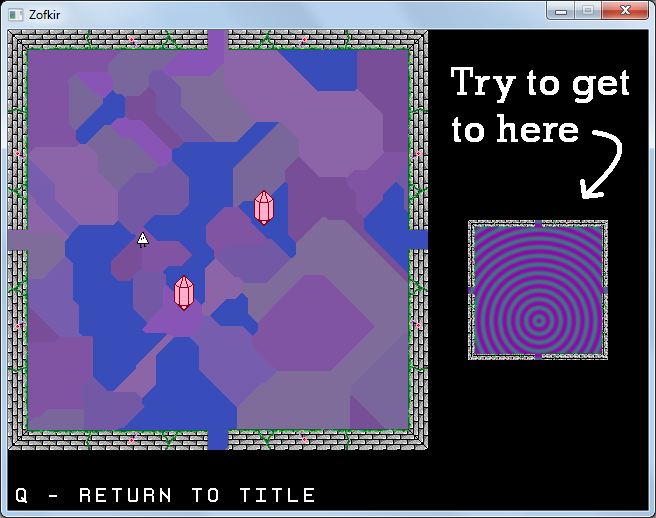
Thus enters Zofkir: A non-euclidean maze game in which a sentient triangle must dodge magical bouncing crystals in search of an image shining brightly into their mind.
Find the game at these lovely links: Windows|Source
Overview
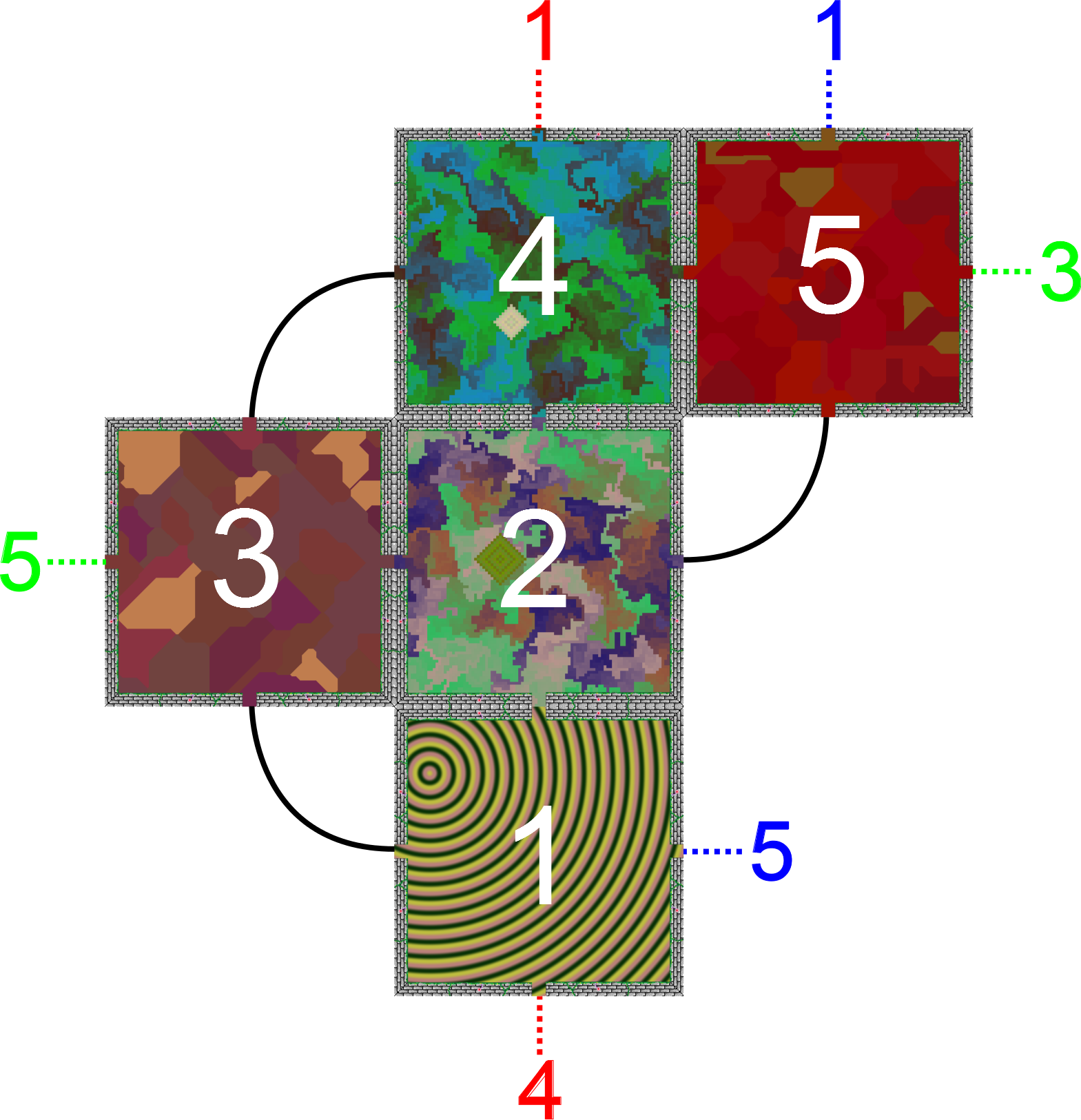
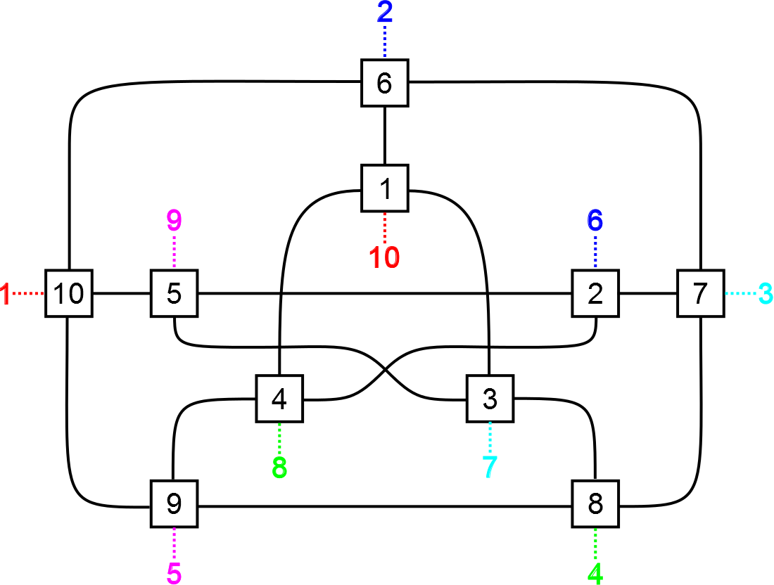
Pictured above is a map of the small-sized dungeon (note: art for each room varies between playthroughs). Players begin in room 1 with the room facing in a default direction. When the player moves from one room to another, the game will line up the rooms based on the passageway traveled through. Normally this is not an issue. Take for example going from room 1 to room 2: the exits line up, so the player will just walk between the two room normally. The problem then enters when the player travels between rooms where the sides do not match up. In order to deal with this situation, the game will rotate the new room to line up with the previous. This is best illustrated with a picture.

In our example above, we walk through the player taking the western exit from room 1 to room 3. This leads to the player entering room 3 from the south side. But hold on: the west exit of room 1 does not line up with the south entrance to room 3. To resolve this situation, the game takes room 3 and rotates it so that the “south” entrance lines up with the west exit from room 1. Now player is in room 3, but with everything oriented differently. If the player then decides to walk to room 2 followed by room 1, they would find that room 1 has changed its direction as well. This leads to the core mechanic of the game: getting into a specific room with the room facing a particular direction.
Dungeon Layout
The layout of each dungeon in Zofkir is pre-determined. Each room is a square with an exit in each of the four cardinal directions, linking it to another room.The map of the Small dungeon is pictured in earlier discussion on the game’s mechanics. The layout was based on my favorite pentomino: the F pentomino. When I was a child a book challenged me to enumerate all 12 pentominoes on my own, and F was the last one I found. It fairly irregular in its symmetries, gives a unique feel, and baffled people simulating Conway’s Game of Life beginning with the unique shape in the days before digital computers could handle the task. Later on when I got into making text adventure games (and the maps for them) I made a simple five room layout based on the F pentomino which later became the basis for the Small dungeon of Zofkir. In fact, thinking about the geometry of this dungeon is the inspiration of Zofkir in the first place!
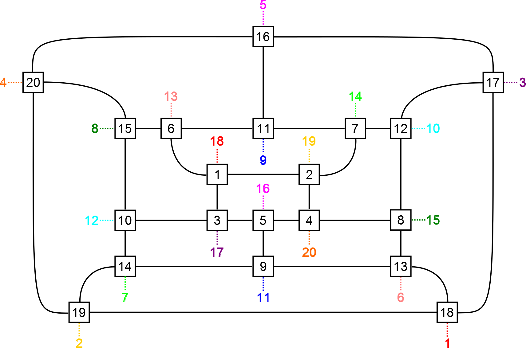
The Medium and Large dungeons are based on two fun cubic graphs: the Petersen graph and the Dodecahedron graph. For each graph, I arranged the vertices and edges on a plane and assigned the endpoint of each edge a cardinal direction for where it was attached to the vertex. This provided most of the connections necessary for Zofkir, but not all. Each vertex still needed one more. To resolve this, I just paired up vertices that were far away in the graph. In the dodecahedron the furthest vertex from a given source is unique, a property not held by the Petersen graph. For that, I paired up each inner vertex with the corresponding outer vertex, shifted over by one-fifth of a rotation. In retrospect, I am disappointed I did not use a different drawing of the Petersen graph than the standard pentagonal one, but that’s in the past now.
In my original goals I had intended to include a random dungeon feature. This would help keep things fresh after players (in theory) master the three pre-defined dungeons. Plus it would allow for dungeons which could reach sizes of 100+ rooms. The primary issue that held this idea back was ensuring that a “good” dungeon would be generated.
So what makes a dungeon layout good then? For me it was ensuring that every possible goal room/orientation was reachable without too many shortcuts. The first part is not too difficult to ensure: we just need to make sure the player can always reach every room from the start room, and that a 90-degree rotation for a room transition existed somewhere. With this, the player could simply go to said 90-degree rotation, run around it enough times, and then walk back to the desired room. Guaranteeing connectivity would be a snap: just generate a spanning tree covering all the rooms and then connect the remaining exits.
The drawback to this is connecting the remaining exits. If I had just picked random pairs of doorways, some less-than-desirable features would pop up. First, we could have passages that lead back onto the same room. This would provide a 90-degree rotation that would be a little too easy to find, diminishing the value of exploring a dungeon and keeping a map. Another undesirable scenario would be to have two or more passages between a pair of rooms. My problem here again is creating too simple a solution; though admittedly not quite as small as before. Also could be slightly extra annoying for players to figure out what is going on in the dungeon.
I’m sure there is a moderately simple way to avoid these issues. For now though, the game will keep its pre-made puzzling layouts.
Room Art
To keep things visually interesting (and so I wouldn’t have to create more art by hand) I had the floor designs of each room be procedurally generated. This is performed at the beginning of each new game, so every playthrough provides a fresh new visual experience for the player and the pattern recognition subsystems of the player’s brain. For Zofkir I implemented three algorithms for drawing a room. A couple others such as fractals were planned, but dropped due to time constraints.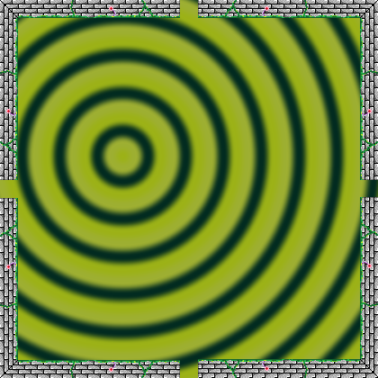
My first programming course in college was at Clemson University. It was one prepared for incoming students who already had some programming knowledge (which is still not standardized terribly well at the high school level). We started off by learning fundamentals of C and how to make PPM images. At the end of one of the first couple classes the professor pulled up a picture of a bunch of concentric red and blue circles, alternating in color and centered at the bottom left corner. Since then I’ve used this design as one of my standards for testing anything with graphics rendering: using a PNG library, rendering a texture in OpenGL, or in this case, making an interesting room for Zofkir. There wasn’t really any fancy shenanigans behind the scenes here. Just pick a few random colors, go to every pixel, find which circle (and color) the pixel is in, and interpolate with the next one out. I did however make sure the randomly chosen center of all the circles was not too close to the center of the map. This was to ensure that when the room was rotated, each rotation would be visually distinct. Had the circles’ center been in the middle of the room, each rotation would look fairly similar.
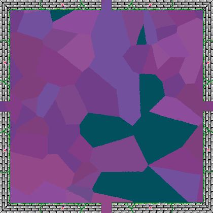
Voronoi diagrams can be a bit of a frustration to compute if we’re looking for the geometry of each cell. Use a Delauney triangulation of a set of points and do some fancy transformations to get the Voronoi diagram. Thankfully I was not interested in obtaining such a structure. Instead I wanted to draw an image where every pixel was colored based on the closest point. As such, I was able to just visit every pixel, find the closest point, and assign a color based on the point. Beforehand, every point was assigned a random “similar” color. Similar colors were chosen from a range of [c0 – 20, c0 + 20] , where c0 was a random value for each color channel (red, green, and blue) chosen at the beginning of the room’s construction. Additionally, a couple points were assigned a special color, different from the others, so that it would be easier to visually tell the difference between rotations of a room.
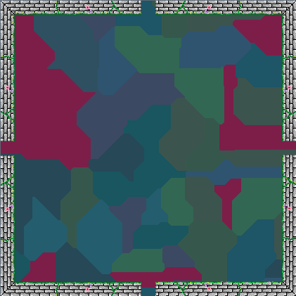
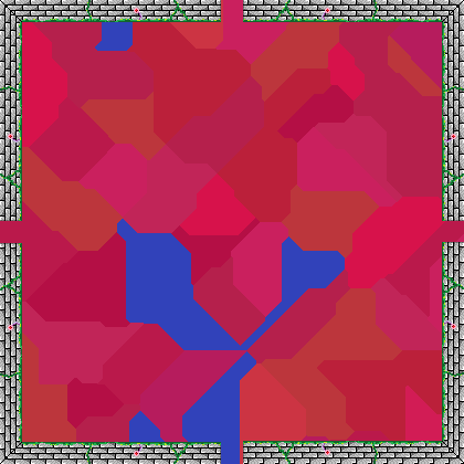
Another advantage of only rendering a pixel-by-pixel Voronoi diagram over finding the geometry is the ease at which I could change distance metrics. In the first case, the closest point was determined by Euclidean distance –the length of the shortest line from A to B. The Manhattan and Chebyshev metrics produced different results visually, which I really like looking at for the 5-10 seconds I’m in a room.
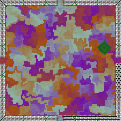
The final room generation method was to basically generate a maze and pour some paint into it. The idea comes from Mike Bostock’s post about visualizing algorithms, particularly the section on visualizing the structure of mazes. Suppose we have a maze and a particular cell in this maze. From here, we can spread out to each neighboring cell one at a time, coloring each cell and changing the color slightly every time we go further away. There’s really not much of a difference here from Bostock’s idea other than how colors are chosen and the strange diamond that appears. In Zofkir, the game picks out 6-10 colors and creates a smooth interpolation of 140-180 colors between each. This amount of density seemed to produce the most visually satisfying results. As for the diamond, it’s just another way to make sure room rotations are visually distinct.
Zofkir Music
For this project I decided on an attempt at making my own background music. My plan was to take a couple sound samples, copy and paste them a bunch of times, and then warp, flip, distort, combine, split, or otherwise transform the samples into a moderately pleasing mess of sound. The goal was to produce something that tried to reflect the slight off-kilter nature of the geometry in the game. I used Audacity where there were no marks for regular measures or anything (or at least not to my knowledge), so I didn’t really pay too much attention to perfect rhythm. Or harmony. Just a nice sequence of sounds taking the player further into light madness.The background noise came from a video of 500 Simpsons episodes at once. Together these feel a bit like a white or pink noise, which I took the obvious route in naming “yellow noise.” In particular, I used a clip from the choir-like sound right at the beginning, sped up a bit for a nice repeat frequency. The foreground was a can opener striking a partially-filled wine glass.
Extra Content Beyond a Maze
Exploring an empty dungeon can be rather dull. I remember doing a remake of Adventure one time, and upon completion of typing in all the rooms and connections offered my father to play it. He responded with a comment about not wanting to explore an empty cave. It was not from any sort of malice, he simply wanted to encourage me to add content. The whole event was fairly negligible; it just happened to stick in my head all these years. Now, there are some games where emptiness can be good, Knytt [url] coming to mind immediately. Zofkir though is not quite one of those games.So to fill in content, I added something I like to put in a lot of my games: moving things to dodge. Due to time constraints I passed up on making fancy things like spinning turrets producing a visual dance akin to a bullet hell. Instead I drew up a spinning crystal inspired by an enemy from Kid Chameleon that would just bounce around indefinitely. I decided to randomize the number of crystals in each room, guaranteeing at least one unless it was the starting room or the goal room (with orientation being correct). To induce randomization, I put in a loop that had a 1/3 chance each time of executing, and would add another crystal to the room. The result is that the number of crystals followed a geometric distribution. So it is entirely possible to end up with a ludicrous amount of 10 or more crystals in a room to dodge, but the odds of this occurring are 1 in 3^10 = 59,049.
Goal Locations
The final random element of Zofkir was the goal. I didn’t really want any particular location to be included since players could just memorize the path. So instead, Zofkir picks a random room and a random orientation at the start of the game. The starting room is excluded from choices to avoid trivial solutions. This however does not exclude the possibility of the goal being located right next to the start room. A possible counter to this would be to perform a check on potential goal rooms being adjacent to the start room. The drawback to this is the small maze, mapped out above. Here, every room is adjacent to every other room (and hence forms a clique), so no such choice exists. Instead, we would have to consider the orientation of the goal room, and make sure that particular orientation is not reachable from the starting orientation. Honestly this is not a terribly difficult condition to analyze, but did conflict with the diminishing amount of development time.Overall Zofkir was a nice start to the One Game A Month jam. It was a small project that get personal momentum going and provided some nice thoughts on where I want to go over the next year. In particular, I want to return to some of the more colorful and geometric art styles I used in several of my games during college. Additionally it gave me a better idea of how much I can accomplish in a month assuming I was back to full speed. So here’s to a great year of game making and blog writing!
Next month: finishing Wireblocks.